What to do when you are getting ready to launch your website?

When you are preparing to launch your website, the first thing you need to do is decide on the number of pages. Usually, everyone has enough except main also "services", "About us" and "Contacts". For creative studios, services are usually replaced by the "projects" page.
After you have decided on the appearance, inspired, perhaps already made your layout, the second thing you need to think about is the content.
The availability and quality of prepared content for a new website reduces the preparation time, and therefore the cost of the website development service. I give a discount to those customers who prepare content responsibly.
Let's say you want to launch your own website on a constructor, or you are preparing content because you have not ordered the service from a web studio. This is a common situation if you want to save money (time and money) or you are a designer or professional in another creative specialty.
You will definitely find it useful
For everyone, you need to write the same title and text about why your company is good and highlight your strengths in short paragraphs.
Site Title
There are two headings: Heading H1 - this information is used on the visible side of the site. Header Title - this information is used by search engines and is written "inside" the site.
The title and description of the page is very important for SEO, in other words, it is important because the correct use of the specified data provides quick access to search networks to rank your future site. Title H1 a person sees, but title may not see. Often these headings coincide:
Headlines for humans
H1: School of Traditional Shaolin Kung Fu
H2: Learn Kung Fu with a Master to find your path and understand the meaning of life.
Headings for search engines
Headline: Shaolin Kung Fu in China Experience the Shaolin Monk Experience for Yourself
Description: Master Shi Yanchen's Kung Fu School is a traditional path of mastering the practice and immersion in Zen Buddhism, and is recruiting students. Learn Kung Fu in China What

Strengths
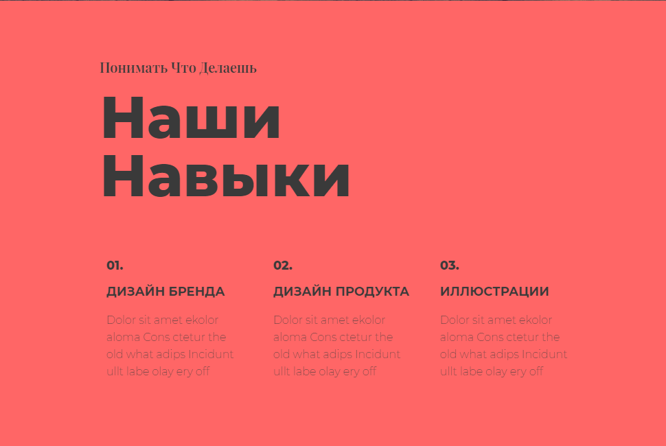
This is the H3 Heading. In this case, these headings are "brand design", "product design" and "illustrations".

For companies that provide services, you can list them, creating the shortest possible titles, and equally short and, most importantly, capacious paragraphs explaining why it is good to order such a service from you:

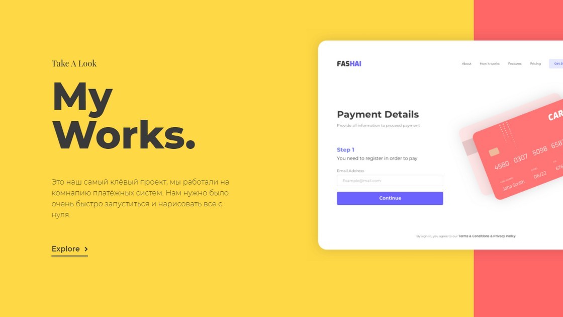
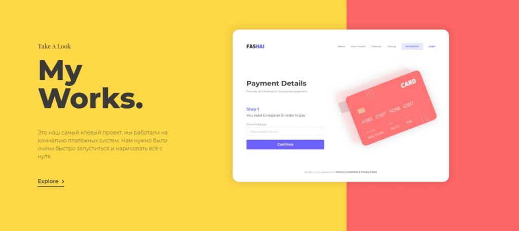
Often services and their description are key, in this case you can add links as shown in the picture above, and create a separate page or pages with a description of these services. In this case, the site as a service has a knowledge base that competitors do not provide, which is displayed separately with a link to the base itself with useful information. For the main page, it may be interesting to write a more detailed text that will touch upon and characterize your key project, where there were interesting tasks and no less interesting solutions, accompanying this with a picture:

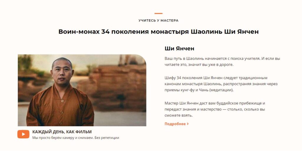
If a specific person is important in your business, the director or foreman is better to say about it briefly on the main page with a succinct description, and leave a link to another page "more details", where the information is also provided in full:

Project Description for a Creative Studio
For a creative studio, it is necessary to sort your projects into separate folders first on the computer, if you are presented with pictures, then prepare pictures and a description of a specific project. It would not be superfluous to indicate the date when you did this, because you want the potential customer to understand the relevance of your work and be able to track the progress in relation to your professional growth.
Create a project folder with images and a text file (txt) with a description. Include at least the following criteria in the description:
- Name
- (Company for which the project was carried out, if this is important)
- Project delivery date (in the future, the date may be automatically pulled from the post publication date, which you can change)
- Project category (Illustration, web design, brand book, etc. from headings)
- Tags (2-3 are enough, only the main ones, but you can do without them)
Specifying tags is important for both search engines and for filtering on your site.
For example, you can specify the tag "font" for a web design and brand book project. This way, a potential customer will understand that a lot of work has been done for you in this project specifically on font design.
Specifying many tags is also bad, for example, if you have only one project with a unique tag, then clicking on it the user will not have useful information from the transition and can close your site. Therefore, practice shows that new tags appear when you have more than one project with one tag in different projects, thereby you connect projects from different categories and create positive user interaction, which increases your rating for search engines.
How to prepare pictures
On the site, pictures are usually divided into several groups:
- Logo and corporate identity
- Projects (quality is important)
- Blog (quality is not important)
- Preview of posts in social networks
All recommendations are not universal, in this case I am guided by minimal knowledge and time investment. You need to present the project well, and at the same time maintain a high site loading speed (you know that no one uploads 4 MB images to the site).
Logo and corporate identity
I recommend using the logo in vector format svg as well as brand elements. I do not include explanations in this article, just follow these instructions and you will be fine.
If it is not possible to make svg, then for the logo on the site it is most often used for the header size 60px in height. For a sharp logo and transparent background, use png after compressing it, for example quoosh.app.
For the site icon, a 512x512 logo image, as well as an open graph thumbnail or a 1200x630 jpg page image, which is used when you post a link to the site on social networks. For example, I use Rank Math for SEO website optimization, this plugin inserts a thumbnail for all pages where such an image is not specified.
To sum it up:
- Logo 60px high in format svg, png, jpg
- Logo 512x512 in format jpg
- Logo (page preview) 1200x630 in format jpg
Create descriptive file names and do not use Cyrillic, for example shaolin-kung-fu-school-in-china.jpg
WordPress Image Optimization and Sizing Best Practices
The main rule: it is better to upload images of 1440x1440 (px), but not more than 2560x2560 (px), if the images are for you representative part. The images are not square, the same value means on one side. In general, the size of the accompanying image for a blog is usually used in a horizontal aspect ratio, for example 16:9 according to the rule above would be a good solution 1440x810 (px) for, although for this blog it is customary to use the final image size of 1120x630 in (full) mode This image is used in several places at once:
- As a title image for a blog post
- As an image when sharing on social networks
Uploading large images, but in in compressed form, will allow you to present high-quality professional images whenever you need them, without long loading times.
If you need an image to take up the entire width of the screen, such as in a full-width slider, we did this for Kung Fu Schools use width 2300px.
Image size and responsive display settings are extremely important in website optimization, especially in connection with with Google innovations, where the site's loading speed is now a criterion for ranking.
Compression
A very important parameter especially for those who export image files from graphic programs from scratch. There is no exact recipe here, but a completely intuitive one will not do.
From Photoshop: in my experience if you have created an image, then when exporting, for example from photoshop, quality 60 is sufficient, but if you have downloaded a high resolution image, say 3000 px, it is most likely already compressed, so you need to experiment. Use the built-in photoshop function export for web. (ctrl+alt+shift+S). You will be able to look at the size of the final image and change the quality. Usually 60-80 for jpeg is the "correct" range.
Online: If your picture loses a lot of quality when you specify quality 60, try online compressors, for example I use sqoosh.app or compress-or-die They usually give good results with standard settings.
You may need to trim the file size. You can use the online service imageresize.org — the special thing is that you can trim a bunch of files at once. I use the desktop app on my PC for this FastStone Image Viewer
Both services offer to compare the quality before and after the image. I suggest those who export the image themselves from Photoshop, first extract it without losing quality (quality 100), and then load it into the compressor, changing the quality visually to achieve the desired result (image size in kb \ visual quality). Remember the result and export it yourself by changing the quality to the same size (kb). Remember the settings and apply them to all images of this type.
The order of uploading an image to WordPress:
- Find an image at least 1600px on one side;
- Compress sqoosh.app image and crop if larger than 1600px;
- Upload to site.
In general, this is enough for a novice user, the rest is up to your system administrator. If you have any questions, write in the comments below.

